The new home of Keller Williams Integrity Realty was never going to be a typical office.
The real estate company needed to fit meeting rooms, training facilities and plenty of individual offices into one large area inside an expansive former retail space on Carling Avenue, across from Carlingwood Mall.
Adding to the challenge was the unique nature of their client’s business: Most realtors spend many hours outside the office, showing and visiting properties. But popular hotelling and shared touchdown spaces weren’t an option, since the confidential nature of a realtor’s client work means they need private workspaces when they’re in the office.
It was a puzzle that Dredge Leahy Architects more than solved, turning an unconventional blank slate into a bright, open workplace that’s a testament to the firm’s creativity and design skills.
Michele Dredge, the lead architect on the project, concedes that the space wasn’t particularly appealing when she first visited. The high, grey warehouse ceilings – a reflection of the building’s previous retail uses – extended much higher than in most offices.
But the architectural firm saw an opportunity in the challenge.

Dredge wanted the space to be comfortable, and knew leaving the ceiling open could be a scary concept for the client. However, she was convinced that the openness of the ceiling would counteract the multitude of offices she had to fit into the space, and Dredge was determined to respond to their needs while also introducing an open-concept feel wherever possible.
Through the use of carefully placed lighting and warm interior colours, the expansive overhead space now gives the Keller Williams office an open and quiet feel.
“One of the biggest challenges was definitely planning,” she says. “We overcame that challenge by giving them a comfortable workplace setting in what was never designed to be an office.”
Engaged workforce
Kendra Baines, who works in agent services, says she was won over by the unique concept after experiencing it firsthand. Though the agent offices are separate rooms, support staff work in a largely open-concept area in the middle of the space.
Thanks to a special sound masking system, Baines says the new office feels both secure and open.
“It engages the agents more,” she says. “It starts conversations.”
One way Dredge added some creativity to the functional new space was with lighting. The entrance is lit by several circular LED bar lights of different sizes that draw the eye upward.

“Everyone wants their wow factor when you walk in,” she says, also noting the skewed lighting in the administration space – “a designer’s whim,” she calls it, but strategically placed to provide consistent light throughout.
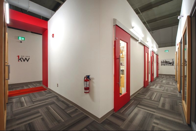
Along the outer walls of the two halls that run down either side of the space are curved lights that illuminate every angle; there’s no targeted light anywhere in the open space, explains Dredge, and the hallways are designed to make the most of the natural light from the windows at the front of the building, with glass office doors and walls throughout that are mostly glazed to take in the light.
“Everyone wants their wow factor.”
Michele Dredge, partner, Dredge Leahy Architects
The long hallways are striped with Keller Williams’s signature red corporate colour, from the carpet to the walls to the blocks that cross the open top intermittently – a clever way of hiding the necessary electrical components, explains Dredge.
The offices range from small spaces for agents who only drop in occasionally to larger offices and some team offices. Space is maximized everywhere; all the offices have sliding doors that save on both space and cost.
Equally important was leaving room for Keller Williams to make the space their own. Pictures of Ottawa line the walls, interspersed with some of the company’s messaging, including a full wall of inspirational phrases opposite the training room. The training room and kitchen at the very back of the space are functional and spacious; the volume of training Keller Williams does meant these two rooms were of the utmost importance.

Dredge says her firm’s experience in the health-care sector is what makes them so comfortable balancing function with creativity. In health care, there are a lot of technical needs to consider when it comes to design, but she also keeps in mind the people using the space and adds creative touches wherever possible.
“I’ve learned a lot doing health care that informs offices,” says Dredge, including intuitive spatial planning.
Ultimately, she says it was the relationship between her firm and the client that helped them maximize the space. Dredge took her clients to see some of the furniture and other features in use and utilized 3D modeling to help them understand how her plan would look upon completion.
“Keller Williams took the risks too,” she says. “We’re a very practical office, but we also want to be able to be really proud … and give it a little bit of that punch.”
This article originally appeared in the 2018-19 edition of Best Offices Ottawa. Read the full publication here:


